NativeScript Repeater: Swipe to Edit / Delete
In a previous post I went over how to add some simple animations to the NativeScript Repeater. In this post, I'd like to take a look at how we can add some nice swipe-based functionality to items in the Repeater. Specifically, we'll be creating a Repeater whose items have two layers: a background layer containing edit and delete buttons, and a foreground layer that will contain the data-item info to display.
If you're not familiar with the Repeater, I encourage you to check out the post mentioned above before continuing as it contains some basic info we'll be building on.
Video Tutorial:
The ItemTemplate
Believe it or not, the most tricky part about this is going to be the template. In order to pull this off, we'll need to employ NativeScript's AbsoluteLayout. This layout is entirely different from the StackLayout in that it stacks its children via the Z axis instead of either X or Y. If you want an item moved along the X axis (left/right), or along the Y axis (up/down), you have to specify this explicitly. Our usage won't need to worry about X or Y at first, just need to get our elements stacking atop one another. Here is a breakdown of the components:
Background View
GridLayout with 3 columns, the one in the middle taking up as much space as possible. The ones on left and right will act as our Edit and Delete action items. This grid will have two rows - the second of which will span across all columns and act as a list item divider.
Foreground View
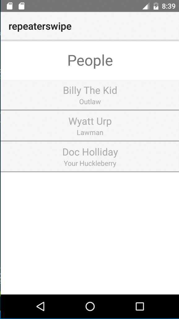
StackLayout housing some info we want users to see about each item in the list. We'll use a simple set of data that is a list of People, each having a name and a position.
<!--main-page.xml-->
<Page xmlns="http://schemas.nativescript.org/tns.xsd" navigatingTo="navigatingTo">
  <StackLayout>
    <Label text="Names" class="title"/>
    <Repeater items="{{ people }}">
      <Repeater.itemTemplate>
        <AbsoluteLayout>

          <!--BACKGROUND-->
          <GridLayout class="actions" rows="60, auto" columns="80, *, 80">
            <Label col="0" row="0" text="Edit" class="action-edit" tap="editPerson" />
            <Label col="1" row="0" />
            <Label col="2" row="0" text="Delete" class="action-delete" tap="deletePerson" />
            <!--DIVIDER-->
            <StackLayout row="1" colSpan="3" class="divider"></StackLayout>
          </GridLayout>

          <!--FOREGROUND-->
          <StackLayout class="info"  pan="onForegroundPan">
            <Label text="{{ name }}" class="primary"/>
            <Label text="{{ position }}" />
          </StackLayout>

        </AbsoluteLayout>
      </Repeater.itemTemplate>
    </Repeater>
  </StackLayout>
</Page>
There are a couple very important things going on here with regards to sizing. Take a look at the XML tag where I've declared the GridLayout: <GridLayout ... rows="60, auto" columns="80, *, 80">. This means that my first row will be 60 units tall (it will contain the 3 columns: Edit Button, Spacer, Delete Button) while my second row (which is the item divider) will be whatever height it needs (i.e. I could set its height to 2 or to 10 and it would take up whatever specified). The next important thing to note is the columns: Column 1 takes up 80 units wide, Column 3 takes up 80 units wide, and Column 2 takes up the full remaining width. Here in a minute we'll need to think about the bounds when panning the foreground view, so these values here give us exactly what we'll need.
Also notice that we've declared some event handlers for the tap events of our Edit/Delete Labels, as well as the pan event of the foreground view.
Finally - we'll use CSS to style the background colors of the button-cells in the first row, style the divider, and set the height of our foreground view to match the height of the background view's first row (remember, that's 60 units in height). That is an important aspect to this approach - you have to set explicit heights so that you don't get funky overlap where a foreground row takes up more or less than a single background view's height and result in all teh sadz.
/*app.css*/
Repeater .actions {
    background-color: lightblue;
    width: 100%;
}

Repeater .actions Label {
    horizontal-align: center;
    padding: 20;
}

.action-edit {
    color: darkgreen;
}

.action-delete {
    color: darkred;
}

Repeater .info {
    background-color: whitesmoke;
    color: darkgray;
    width: 100%;
    height: 60;
    vertical-align: center;
}


Repeater .info Label {
    horizontal-align: center;
}

Repeater .info .primary {
    font-size: 20;
}

Repeater .divider {
    height: 2;
    background-color: darkgray;
    width: 100%;
}
Wiring Up Events
Our code file for this page will need to implement all the functions declared in the view. Here's a breakdown of what these are, and their purposes:
navigatingTo: This event is fired when our page is being navigated to. It's where we can wire up the data source (akabindingContext) for our page.editPerson: The background view exposes a UI element that should initiate some edit functionality when tapped. For this demo, we'll just console log the info of the Person being edited as our primary focus is on the panning of the foreground ;-)deletePerson: The background view also exposes a UI element that should delete a Person from the list when tapped. Here again, we'll just console log the info of the Person.onForegroundPan: This function is called while the foreground view is being "panned" (i.e. tap and drag). It's the focus of this post - just took us a minute to get there ;)
Knowing that this is the API of our Page's code file, let's go ahead and scaffold that out:
/*main-page.ts*/

// Imports
import { EventData } from "data/observable";
import { ObservableArray } from "data/observable-array";
import { Page } from "ui/page";
import { View } from "ui/core/view";
import { AbsoluteLayout } from "ui/layouts/absolute-layout";
import { PanGestureEventData, GestureStateTypes } from "ui/gestures";

// CONST or top-level vars will go here

// Event handler for Page "navigatingTo" event
export function navigatingTo(args: EventData) {
    // Get the event sender
    var page = <Page>args.object;

    // Set the binding context - simpl list of people
    page.bindingContext = {
        people: new ObservableArray([
            { name: 'Billy The Kid', position: 'Outlaw' },
            { name: 'Wyatt Urp', position: 'Lawman' },
            { name: 'Doc Holliday', position: 'Your Huckleberry'},
        ])
    };
}

export function onForegroundPan(arg: PanGestureEventData) {
    // Where the *magic* happens
}

export function editPerson(arg: EventData) {
    // In a repeater itemView's tap event, the bindingContext of the item tapped
    //   is the item from the list of items at the corresponding index
    //   (i.e. third item's template is tapped, its binding context is the third item)
    let dataItem: any = (<View>arg.object).bindingContext,
        // since arg.object is the View that was tapped, we can get the full list
        //    of people easily as each View holds a ref to its Page, and we know
        //    what the page's bindingContext is b/c we set it in navigatingTo()
        personList: any[] = (<View>arg.object).page.bindingContext.people,
        idxToEdit = personList.indexOf(dataItem);

    console.log(`Edit item #${idxToEdit+1} - ${dataItem.name}`);
}

export function deletePerson(arg: EventData) {
    // Same exact mechanism as editPerson() to get proper index, etc...
    let dataItem: any = (<View>arg.object).bindingContext,
        personList: any[] = (<View>arg.object).page.bindingContext.people,
        idxToDelete = personList.indexOf(dataItem);

    console.log(`Delete item #${idxToDelete+1} - ${dataItem.name}`);
}
Okay, now we're cookin'! We just need to handle the pan event. This is actually super easy, but there's some setup we need to do first.
Remember how I pointed out the widths of the UI elements for editing/deleting a Person? If not, it's 80 units - and one is on the left of the screen, the other on the right, and in the middle is an empty spacer that just takes as much room as is available between them. If you recall, we also have to explicitly set the X and Y coordinate for our absolutely-positioned items if we want them to move from 0,0. These pieces of info give is the minimum X that the foreground should ever be allowed to move to, -80, and the maximum X that it should ever be allowed to move to, +80.
// CONST or top-level vars will go here
const
    MIN_X: number = -80,
    MAX_X: number = 80;
Now that we have the min/max that the user can pan the foreground to, let's write the code to make that happen!
export function onForegroundPan(arg: PanGestureEventData) {
  let absLayout: AbsoluteLayout = <AbsoluteLayout>arg.object,
    newX: number = absLayout.translateX + arg.deltaX;

  if (newX >= MIN_X && newX <= MAX_X) {
    absLayout.translateX = newX;
  }
}
Notice here that the AbsoluteLayout, actually any View object, has a translateX property - this is how we can set the X coordinate of our absolutely-positioned view! Also notice that the PanGestureEventData interface has this deltaX property. This tells you the actual amount the user has moved the item regardless of where they started panning. When the pan starts, it starts at 0 and goes up or down from there depending on if the user pans left or right.
And it's that simple! But, have you seen the big flaw that we're left with? What happens if a user only pans part of the way? Wouldn't it be nice if we could anticipate which direction they were heading, and finish the transition for them or reset it back to 0? Fortunately, this is also super easy.
Let's create another const called THRESHOLD - this is going to be the percentage of the way the user needs to swipe the element in order for our code to complete the swipe instead of resetting to 0. Let's go ahead and set it to 0.5 - meaning the user has to swipe >= 1/2 of the way in either direction before letting go for us to take it the rest of the way, otherwise we'll push it back the opposite way until it hits the min, max, or zero.
const
    MIN_X: number = -80,
    MAX_X: number = 80,
    THRESHOLD: number = 0.5;
Now that we have our threshold, we need to be able to tell when the user is done with their swiping, and we can take it from there. Fortunately, the PanGestureEventData interface has a state property that tells us exactly that! Let's update our onForegroundPan function to make sure we don't leave the user stuck between actions!
export function onForegroundPan(arg: PanGestureEventData) {
  // ... get the view reference, set the translateX, etc...

  // after that, check and see if the user is done panning
  // also check to make sure we aren't already at the min or max we can go
  if (arg.state === GestureStateTypes.ended && !(newX === MIN_X || newX === MAX_X)) {
    // init our destination X coordinate to 0, in case neither THRESHOLD has been hit
    let destX: number = 0;

    // if user hit or crossed the THESHOLD either way, let's finish in that direction
    if (newX <= MIN_X * THRESHOLD) {
      destX = MIN_X;
    } else if (newX >= MAX_X * THRESHOLD) {
      destX = MAX_X;
    }

    absLayout.animate({
      translate: { x: destX, y: 0 },
      duration: 200
    });
  }
}
And boom! it's that easy with NativeScript!
-Bradley